

Published 4 November 2026 · By JonsTech
Turn SaaS Onboarding Steps into Useful Social Media Content
A practical way for SaaS founders to turn one onboarding task into helpful social posts and screenshot carousels, then review and schedule a small series in WooshOut Campaign Studio.
To turn onboarding into social content, start with one task a new user needs to complete. Explain the problem it solves and the outcome the task is designed to help them reach. Write that as a short post; add an approved product screenshot as a carousel only if it makes the steps clearer. In WooshOut Campaign Studio, you can draft a small series, edit each post, choose suitable destinations and schedule the reviewed work. The aim is to teach, not to publish your product manual one screen at a time.
Start with the user's job, not your feature list
An onboarding checklist often follows the route through your interface: create an account, open a setting, connect a tool, save, continue. That sequence may make sense to someone already using the product, but it is not automatically a compelling social post. A reader needs to know why the task matters and what they will understand or be able to do afterwards. Describe the benefit as the task’s intended purpose, not a promised result for every user.
For example, imagine a hypothetical SaaS app that helps a small team organise project requests. Its onboarding flow might ask the user to create a workspace, invite a teammate, and make a request form. The useful content is not a list of buttons to press. It is the problem behind the steps: requests arriving in scattered places can be hard to organise. A post can explain how a shared form gives the team one place to start collecting them, without claiming it will make a particular team faster or more productive.
Choose one onboarding task and shape the message
Pick a single task that has a clear purpose. Don’t try to explain workspace setup, permissions, integrations and reporting in one caption. A simple writing frame keeps the post useful and focused:
Name a recognisable problem or question. What might a new user be trying to sort out?
Explain the task in plain language. Use the product term if it is helpful, then say what it means.
Describe the intended outcome. What does completing this step let the user do next?
Offer one next action. Keep it relevant to the task, rather than turning the post into a general sales pitch.
For the hypothetical project-request app, a first draft might say: “New requests are easier to review when they start in one place. Create a request form for the information your team needs, then share it with the people who send work your way.” That is more useful than “Go to Settings, choose Forms, click New.” The interface route can still appear in a carousel or help article, where someone who needs the exact instructions can use it.
Use screenshots to clarify, not decorate
A screenshot carousel earns its place when it helps explain a decision or a sequence. Show the relevant part of the interface, keep each slide focused on one idea, and use short annotations to explain what the viewer is looking at. If the image adds no information beyond the caption, publish the text post on its own.
Before building the carousel, check that the screenshots are approved for public use. Remove or obscure real customer names, email addresses, private project details, internal notes and any other information that should not appear in a promotional post. Use a clean demo account when possible. Organising approved images in named collections can also make it easier to find the right asset for future posts. For more on that step, see how to organise SaaS screenshots for social media campaigns.
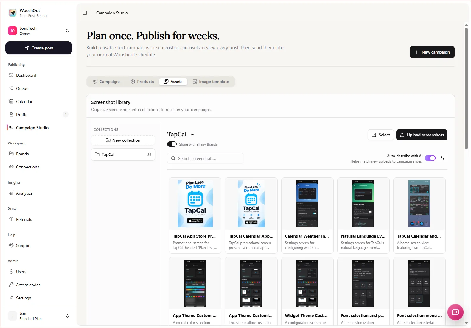
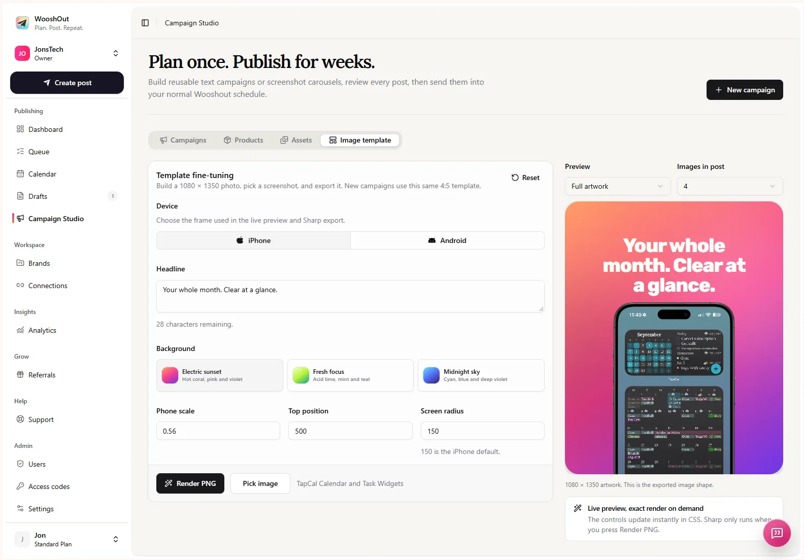
Campaign Studio’s image campaigns use uploaded screenshots and a reusable template to create image posts with three to six slides. You can select a phone frame, adjust template choices, and review or edit the generated posts. Treat the result as a starting layout: check that the screenshot is legible, the slide headline is accurate and the carousel makes sense without relying on an explanation the viewer cannot see.
Build a small, connected series in Campaign Studio
Instead of generating a long campaign from every onboarding screen, choose a handful of useful user tasks. A hypothetical series for the project-request app could cover making a form, sharing it with a requester, and reviewing incoming submissions. Each post should answer one question; the series can connect them through the wider theme of organising requests.
Here is an example of an edited post for the hypothetical form task:
“Project requests arriving in chat, email and hallway conversations can be difficult to keep together. A shared request form gives people one clear place to send the details your team needs. Start with the questions you actually use, then share the form with your team. What’s the first detail you ask for when a new project comes in?”
The wording describes a common problem and what the task is meant to do. It does not suggest the app has been shown to improve activation, save time or produce a particular business outcome. Replace the hypothetical details with your real workflow, product language and approved material before using any example in a campaign.
Adapt the post before choosing destinations
A useful series does not have to look identical on every network. Campaign Studio text campaigns are directed at Facebook, Threads and X. Image campaigns can be prepared for TikTok, Instagram, Facebook, Threads and X, subject to the selected image mode and compatibility checks. YouTube is not an image-campaign destination. Check the connected account, supported post format and current compatibility indicators for each destination before scheduling; avoid assuming every caption or image will fit everywhere in the same way.
For each post, ask whether the opening line suits the destination, whether the screenshot remains readable in its crop, and whether the call to action makes sense there. Edit the caption where a network needs a shorter introduction or different wording. WooshOut’s broader publishing workflow also supports shared copy with platform-specific changes where available; the workflow guide explains how to check compatibility and follow each destination’s publishing status.
Review before you schedule
AI can help turn a brief into draft posts, but it cannot confirm that your product behaves as described or that a screenshot is safe to share. Before scheduling, check every claim against the live product, confirm that interface labels and steps are current, and make sure the images are approved. Remove repeated posts, add context where a draft assumes too much, and leave out any claim about customer results that you cannot substantiate.
Then choose the connected accounts that suit each post and set a cadence that leaves room for other content. A short educational series can sit alongside product updates, customer questions or demonstrations; it does not need to dominate the feed. Campaign Studio can schedule the reviewed campaign into the usual Calendar and Queue. After scheduling, check destination-level status so you can see which posts published and which need attention.
The practical test is simple: would someone who does not know your interface understand the problem, the task and why it may be useful? If the post only names controls, rewrite it around the user’s job. If a screenshot genuinely makes the explanation clearer, use it. Start with one real onboarding task, one approved asset and one carefully reviewed post, then build the rest of the series from questions your users actually need answered.